Helping newly engaged couples start their wedding planning journey.

Problem
You only have one chance to make a first impression. Onboarding is a product's opportunity to welcome users and build trust. For newly engaged couples signing up for the Knot, research showed that this first impression can make a huge impact.
We saw that 55% of users who sign up and complete onboarding never return to the site. We heard from users that the first experience with our product was overwhelming. They are presented with all of the options but aren't guided toward what to do first.
This all starts with onboarding. How might we create an engaging first-time flow for couples so that we can learn more about them and better personalize their experience?
goal
Increase the number of new users that return to our site by create a more fun and engaging first onboarding flow.
process
Research
-
Observe users navigating through current onboarding
-
Review data on how many users get through onboarding
-
Analyze our current homescreen and where people navigate from there
-
Competitive analysis

Best practices comparison
What we found
-
About 70% of couples complete the onboarding flow
-
On average, 33% of couples skip providing personal data
-
Couples are willing to provide personal information, but expect it to influence their experience
-
Friction points where couples struggled to input information
-
Couples don't immediately see their responses reflected back on homepage


Approach
Based on this research, we developed short-term, mid-term and long-term tactics for improving the onboarding experience.
Short-term, we intended to:
-
Simplify the UX
-
Optimize data collection
-
Better in the brand and make the flow more fun
-
Reflect their information on the homepage
As part of this work, I collaborated with other designers across teams to align on a template for this type of full screen experience:


Final Solution
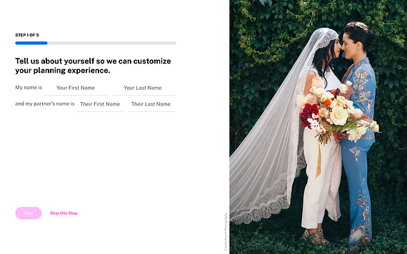
The final design addressed each of our short-term tactics:
Simplify the UX: dropdown selections replaced with displaying options; only ask one question per slide

Optimize data collection: remove explicit skip by including an option for users to select 'We're not sure yet'; include the why behind what we are asking

Better in the brand and make the flow more fun: we updated photography, included confetti during celebratory moments, and updated the copy and tone


Reflect their information on the homepage: while major changes to the homepage were not in scope for this project, we made an update to display key data points in the header

Results
We ran this onboarding as an A/B test, and saw overall 2.2% increase in the number of new users returning to the site. We intend to build on this momentum with future experiments aimed at collecting information like style and priorities and further personalizing the homepage.